A Study on ASA and Pledge Growth/Decline for St. Paul’s Bakersfield
*This is a revision of an unpublished study by Aaron Conner. The need for revision was due to new information on 2017 pledges and the need to determine significance using t-values instead of z-values. Further, I noticed that the pledges were not distributed normally (ie.Bell Curve) and had to change the method of finding the averages. The change in values did change any results in Average Sunday Attendance but did change results in pledges. This information may be shared with members of St. Paul’s community. Inquiries to share outside the community or publish can be made at [email protected]
I began this study researching elements of church growth/decline. So far, many of these studies involve variables surrounding the leadership, location, nature of beliefs, friendliness of the congregation, ect., but none in my search yielded much in the way Average Sunday Attendance as related to the amount of pledges. We use ASA and pledges as indicators of where a congregation is standing; they are probably the most readily numbers we have available when it comes to growth/decline. For example, if we know that a congregation has x amount of pledgers at any particular ASA, then a chance in ASA would predict a change in pledging.I assume that the relationship between the two will vary from congregation to congregation, but in general, give or take about 5%-10% in visitors or new comers on any given Sunday, I hypothesized that the number of pledges would be in the ball park of ASA. Further, I hypothesized that as ASA grows or declines, the growth or decline would be reflected in the amount of pledges given.
Method
While I assume this hypothesis would be the case for many congregations, for reasons of emotional and spiritual attachment I looked to St. Paul’s to begin my study. Thus, my research question asked about the relationship between St. Paul’s Average Sunday Attendance (ASA) and the amount of pledges. The purpose of this study was to find out if there is any relationship between St. Paul’s ASA and pledge trends based on data from the past three years. The data for ASA was collected as recorded in the “Red Book”, and the Average Pledge per Person, Average Number of Pledgers, and Average Total Pledge per year were obtained thanks to Treasurer Dave Oliver. The years in question were 2014-16 for ASA, and 2014-17 for Pledges. I then used these averages to determine if any of the years in question revealed any trends.
The study of statistics has two fields, Descriptive and Inferential. Inferential tests were done to test for significance, but the majority of this study is descriptive. I hypothesized that if there was a definable trend in St. Paul’s ASA then it would be reflected in the amount of pledges.
Before going further-I don’t want the reader to be too bogged down in stats jargon, but a few things need to be refreshed.
Variability-or Standard Deviation (SD)-is the amount of variation in a set of scores or numbers. The more variation, the less the scores are likely to be distributed closer to the mean and are more likely to be spread out apart. A larger amount of variation in a set of numbers is generally a good thing.
Standard Error (SE)-or the Margin of Error-is the amount that each score is expected to deviate from the mean. A smaller SE is preferred especially when using the scores or numbers for prediction.
Correlation is how related two or more variables are related is i.e. the relationship between speed limits and speeding tickets, the number of hours it takes Episcopalians to finish the peace and the number present. In correlation, relationships range from -1 to 1. The closer to -1 or 1, the stronger the relationship. Remember, correlation implies there might be a relationship, but does not imply causation.
Variance is how much of one variable is accounted for in another.
Significance is when a score is above or below the mean at a level which is statistically significant. The tests used to prove significance assume that there is no difference in between sets of scores and when a score is found significance it reveals that the score is statistically difference from the rest.
All tests for significance were done at the conservative standard, 0.05 Two Tails, 95% Confidence Level.
Results
Average Sunday Attendance
When collecting data I initially thought it made sense to study full years starting with 2014, the first full year after Grace moved to St. Paul’s. In retrospect I now regret that decision as 2014 saw a decline in ASA and I am curious as to when that decline actually started. In any case, ASA for the 2014 was 116 with an error of 4 and variability of 7. The linear regression line is sloping at -1.68. The ASA for this year is correlated at -.82. When taking into account the mean for the past three years, 116 is significantly above the mean for these three years. On average, 2014 ASA per month varied between 114-120. The distance between the variability and error (though not huge) along with a very strong negative correlation indicated that St. Paul’s ASA was decline 1.68 every month (or 3-4 every two months).
2015 was a transition year for attendance. The ASA dropped to 111 with an error of 2.6 and variability of 3.6. The line is sloping at -.47 and the ASA by month are correlated at -.56 (weak to moderate). The ASA for 2015 did not test significantly, meaning the ASA is right around the mean. The small gap between error and variability, and the weak/moderate correlation indicate that decline in ASA slowed down in 2015 at 1 person per two months.
2016 shows St. Paul’s more or less at a standstill. ASA dropped significantly below the mean at 105. Variability at 4.48 and error at 4.61, and correlation next to none at .18 reveal that ASA, overall did not decline, nor did it grow. The slope perked up at .22 (1 person per 5 months) but this does not make a significant difference.
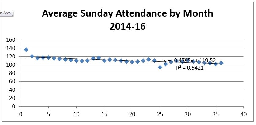
Overall, the ASA from 2014-16 was 110. Variability at 6.7 and error at 4.7 indicate that ASA by month was between 105 and 115. These three years are correlated at -.70 (moderately strong) and ASA declined an average of 1 person per two months. I suspect that attendance on the three Easter Sundays was high enough to skew the data and raise the ASA and lower correlation; otherwise, this is a fairly normal distribution where data fills the center of the “bell.”The past three years in time account for 54% of the relationship with ASA. This means that while there is trend to decline as time has gone on, 56% of this relationship is caused by variables other than time itself. Take, for example, in the graph below, the drop in ASA at 25 (January, 2016). This drop is only accounted for by the overall trend at 54%, 56% was cause by other variables.
*Y-axis is ASA. X-Axis is numbered months (10=Oct/14, 20 20=Aug/15, ect)
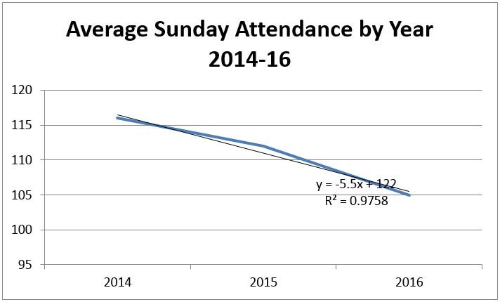
If we treat the year means as representative of the whole year, analysis reveals a similar yet stronger conclusion. In the past three years, ASA by Year has been dropping at a rate of 6 people per year, with a correlation of .98. 97% of the decline in ASA is accounted for in time as the years went on.
If we treat the year means as representative of the whole year, analysis reveals a similar yet stronger conclusion. In the past three years, ASA by Year has been dropping at a rate of 6 people per year, with a correlation of .98. 97% of the decline in ASA is accounted for in time as the years went on.
Pledging
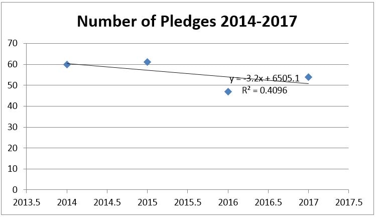
Overall, the number of pledges from 2014-2016 has been on a steady decline, about 3 pledges dropping per year with a correlation of .60, moderately-weak relationship. The mean number of pledges is 56. 40% of this relationship is accounted for in the two variables. When testing for significance, only 2015 and 2016 showed as being different from the mean. 2015 had 61 pledges, just high enough to test higher than the mean, and 2016 had 47 pledges, a very significant drop. Thus, 2014 (60 pledges) and 2017 (54 pledges) are right around the mean pledges for this period. The number of pledges for 2017 jumped up three standard errors from the previous year, a good bounce back from a year that where ASA and pledges numbers were at their lowest. Kudos to the 2016 Pledge Drive.
Overall, the number of pledges from 2014-2016 has been on a steady decline, about 3 pledges dropping per year with a correlation of .60, moderately-weak relationship. The mean number of pledges is 56. 40% of this relationship is accounted for in the two variables. When testing for significance, only 2015 and 2016 showed as being different from the mean. 2015 had 61 pledges, just high enough to test higher than the mean, and 2016 had 47 pledges, a very significant drop. Thus, 2014 (60 pledges) and 2017 (54 pledges) are right around the mean pledges for this period. The number of pledges for 2017 jumped up three standard errors from the previous year, a good bounce back from a year that where ASA and pledges numbers were at their lowest. Kudos to the 2016 Pledge Drive.
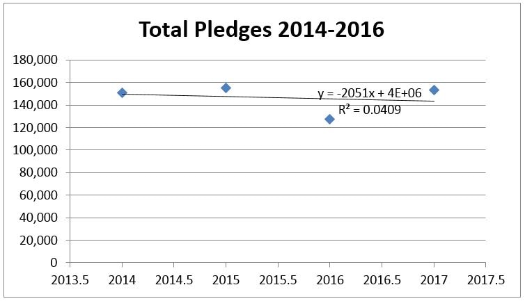
We see the Total Amount of Pledges follows a similar trend where the number of pledges mirrors the Median pledges, however, none of the totals for 2014-2017 tested as significant. The totals all sit around the Total mean of $146,809.50 with almost no correlation. The Total amount of pledges given has neither significantly risen nor fallen since 2014.
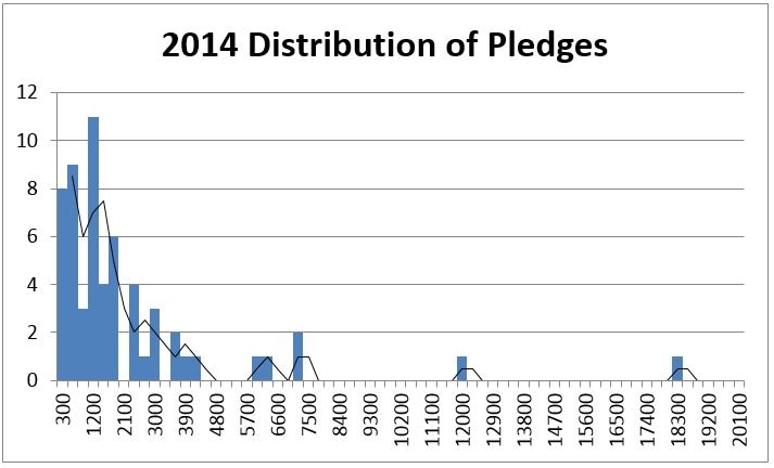
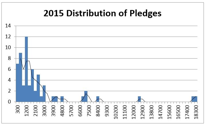
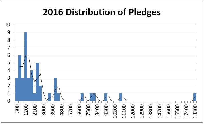
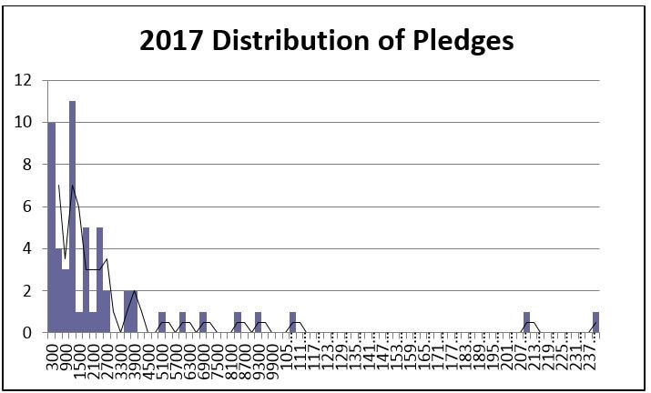
The data on individual pledging is not as clean. In a normal distribution, the majority of the data fall in the middle forming a Bell Curve. When the individual pledges are distributed by frequency, we see that the data is very heavy on the left and tapering off to the right. The Mean of a data set like this cannot be used because it is skewed and will not accurately describe the average pledger. Thus, the Median is an appropriate measure available to describe the average pledger. The Median is the exact middle number and is accompanied by a range of pledges which are also seen as typical in the data. The Median is handy in that it is not influenced by outliers, numbers far enough from the mean to skew it inaccurately, and easily identifies them. Because significance testing relies on an accurate Standard Deviation and Standard Error, which rely on an accurate mean, no tests were done on average pledges.
The Median average for 2014 was $1200 per person with a range of $1850. The bulk of the pledges are in the $0-$3050 range. There were seven outlier pledges that totaled in $77,240, 77% of the Total 2014 Pledges.
The Median average for 2014 was $1200 per person with a range of $1850. The bulk of the pledges are in the $0-$3050 range. There were seven outlier pledges that totaled in $77,240, 77% of the Total 2014 Pledges.
The Median average for 2015 was $1225 with a typical range of $1800. The bulk of the pledges are in the $0-$3025 range. There were 8 outlier pledges that contributed in the amount of $82,880, 53% of the Total 2015 pledges
The Median average for 2016 was $1220 with a typical range of $1560. The bulk of the pledges were in the $0-$2780 range. There were seven outlier pledges that totaled in $65,160, 51% of the Total 2016 pledges.
The Median average for 2017 is $1200 with a typical range of $1869. The bulk of the total pledges is in the $0-$3069 range. There are eight outliers contributing $34,200, 37% of the Total 2017 pledges.
Number of pledges dived down between 2015 and 2016. Overall, the average pledges and their totals stayed the same. What is most important to note is that the typical range for 2016 dropped down astonishingly more than any of the pledges did and the range for 2017 bounced up to the largest in the data set. Further, 2017 outliers make up the least amount out of the total pledge. This indicates a clear turn around in both the number and amounts that people are pledging.
Discussion
Returning now to the original hypothesis, the results are inconclusive. When the proportions of the number of pledges, median pledges, and total pledges are compared to the ASA, neither combination reveals and statistical significance. Thus there is no relationship between St. Paul’s ASA and pledges. However, I do feel that should the number of pledges come closer to ASA, then the pledges would be distributed normally and there would be a greater likelihood of finding a significant relationship. In the meantime, it is best to discuss ASA and pledging as mostly separate entities.
While it is generally not kosher to use linear regression for predictions outside of the known x and y values, I offer the following as a “what if” scenario. This study has so far resulted in moderate-strong correlations and significant at a 95% confidence level that these numbers aren’t just flukes. So, take them as Dickens’ Ghost of Christmas yet-to-come, the following predictions are what may be to come if variables do not change in the future.
If the variables that surround ASA do not change, the prediction for ASA by the end of 2017 will be 96. In 2014, 51% of the ASA was pledging, 54% in 2015, and 44% in 2016. If ASA prediction were to come true, 56% in 2017. Overall, up until 2017, drops in pledging did resembled ASA decline. 2017 might be a critical year for St. Paul’s as it is the year where the ASA tend continues to drop and pledges trends are on the rise. Because the number of pledges has had a wild card tendency, it use impossible to establish a clear link between pledging and ASA.
Conclusion
St. Paul’s is at a tipping point. I have two things to offer. 1) In my mind, one would want ASA and the number of pledges as close together as possible. Assuming 10% of any given Sunday is made of visitors and newcomers, then 90% of pledges would be coming from the rest of the ASA. In St. Paul’s case, 2016 saw only 44% was pledging, missing 46%. Last year’s pledge drive was very effective in the average amounts of pledges being raised and was somewhat effective in the total number of pledges. Those who heard the message responded loudly, but one has to wonder if or why the rest didn’t respond or didn’t hear? In any case, I am as well predicting that the more the number of pledges approaches the ASA, the more the distribution of pledges will be normal. 2) While pledging appears to be on the mend, ASA has been in trouble. Although I found no relationship between ASA and pledging and cannot predict when the two variables will unravel, it is conceivable that St. Paul’s can only handle decline and pledge growth for so long. 3) The opportunity arises to flip the question and ask if there are variables affecting the pledges which in turn affect the ASA. Until a relationship is established, we also can’t be entirely sure if the unaccounted for variables aren’t effecting ASA and pledging.
This study is limited in the fact the information gathered is only representative history. St. Paul’s/Grace Episcopal is still young, and while 4 years of average data is probably a decent representative sample, more might be needed in order to ensure accuracy and significance. As well, the skewed distribution in the pledges prevented establishing a relationship between ASA and pledging. The point of this study was to see the relationship between St. Paul’s ASA and pledging in the bigger picture; this study does also does not go in depth beyond ASA and pledges and does not take into account any other variables. For this reason I am currently developing a subsequent survey which will compare St. Paul’s to growth/decline trends that are being studied in the wider church. In this study, St. Paul’s will also be compared to another congregation with different ASA and pledge trends as well as a different geographical, historical, and liturgical context. Comparing the two may reveal how a congregation can work with its context to promote growth and stop decline. Feedback and questions are most welcome.
[email protected]
